Chipotle App Redesign
The Chipotle App’s Purpose:
The purpose of the Chipotle app is to make getting chipotle a little bit easier while also earning exclusive deals and points to get some extra items in your bag for a lower price. There are options to order for pickup and also order for delivery. I think a big purpose is also to cut the line out of the question and get your food faster. Finally, going into Chipotle can be intimidating because of all the options and sometimes you don’t even know things exist on their menu, but if you have the app you are able to see all of their options and customize how you prefer.
Description of project?
“Like a tiny Chipotle that lives in your phone, our app lets you order real, delicious food for pickup or delivery. Members bank points automatically for in-app orders.”
Problem
I am aiming to solve the issue of the confusion the app can bring and making it simpler. I decided to fix this because when I first started using the app, I found it to be hard to use when trying to find specific things. There was also similar information in multiple places which confused me because I wasn’t sure where to go, specifically with the points and rewards.
Process
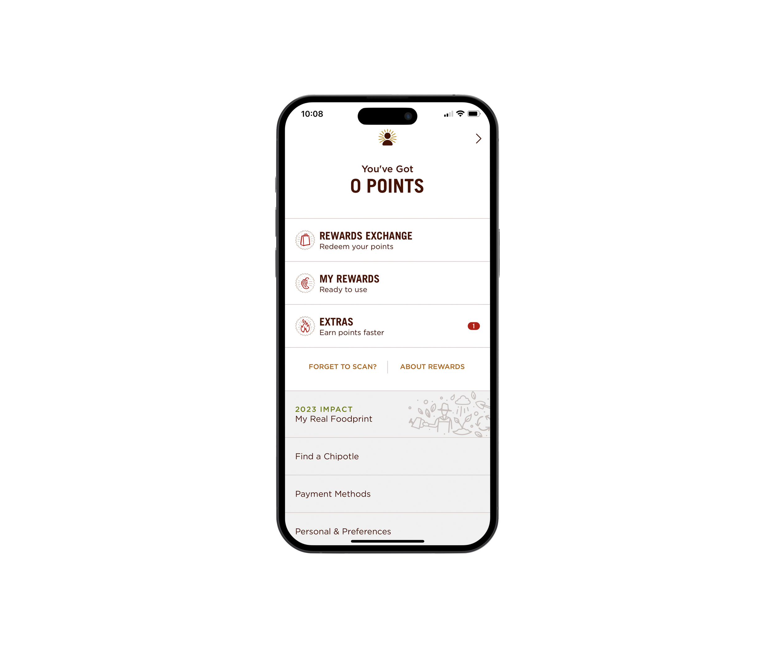
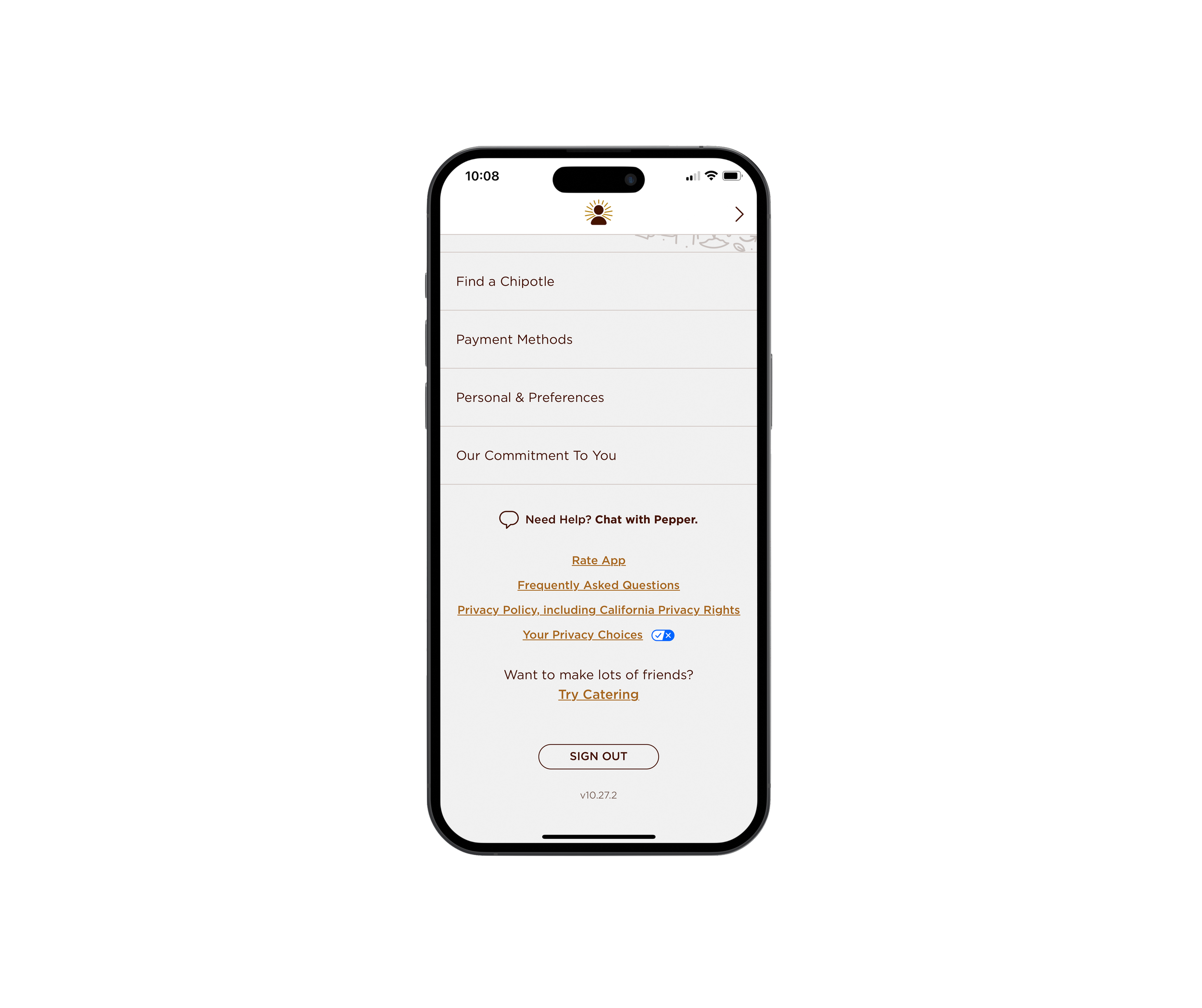
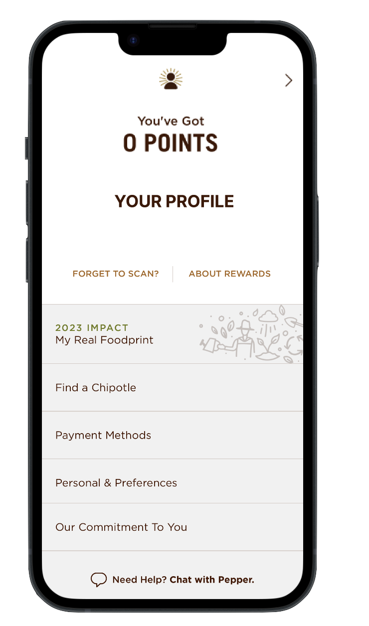
I started by brainstorming what could be fixed on the Chipotle app based on what I found confusing while using the application. I realized that I wanted to improve usability by simplifying the “profile page” and moving the rewards and point into only the “rewards” tab. I found all the information on the these pages to be overwhelming and redundant.
When looking at what the Chipotle app looks like currently, you can see that the rewards can be found in two places with different content in each section, making it confusing and overwhelming for the user.
Solution
Once I had my idea of what I would be changing, I began to prototype my app. I began with mimicking the already designed app with all of its features. And then implementing my changes. Below is the recreation that was built before user testing was done.
Recreation
Profile Page Improvements
Impact
I achieved my goals and objectives of improving usability by simplifying the “profile page” and moving the rewards and points into only the “rewards” tab.
I think the design changes to the Chipotle app that I have suggested will benefit the user because the Chipotle app already has a lot of necessary information because they have a large menu but by simplifying even one aspect will give a clear understanding of where things are and not overwhelm the user.


